Seeing is believing!
Before you order, simply sign up for a free user account and in seconds you'll be experiencing the best in CFA exam preparation.
Subject 2. Charts Types
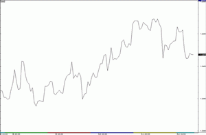
Line Chart
A line chart is a simple graphic display of price trends over time. It can give a broad overview of investor sentiment.
Bar Chart
A bar chart has four prices per data point entry: the high price, the low price, and the opening and closing prices.
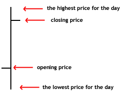
It can give an analyst a sense of the nature of that day's trading (price movement during the day).
Candlestick Chart
A candlestick chart is similar to a bar chart as it provides the same four bits of data in each entry. The hollow or filled portion of the candlestick is called the "body." The long thin lines above and below the body represent the high/low range and are called "shadows" (also referred to as "wicks" and "tails").
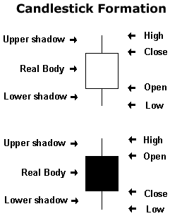
- If the stock closes higher than its opening price, a hollow candlestick is drawn, with the bottom of the body representing the opening price and the top of the body representing the closing price.
- If the stock closes lower than its opening price, a filled candlestick is drawn, with the top of the body representing the opening price and the bottom of the body representing the closing price.
A big difference between a bar chart and a candlestick chart is the relationship between opening and closing prices. The price movements are much more visible in a candlestick chart.
Point and Figure Chart
Both axis of P&F charts' are dependent on price, rather than one being based on price and the other on date. The key unit in a P&F chart is the point, or unit of price.
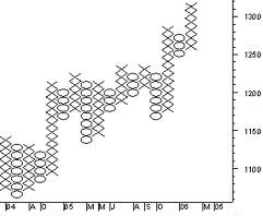
The Xs represent upward price trends and the Os represent downward price trends. Each box on the chart represents the price scale, which adjusts depending on the price of the stock; the higher the stock's price, the more each box represents. On most charts where the price is between $20 and $100, a box represents $1, or 1 point for the stock.
The other critical point of a P&F chart is the reversal criteria. This is usually set at three but it can also be set according to the technician's discretion. The reversal criteria set how much the price has to move away from the high or low in the price trend to create a new trend or, in other words, how much the price has to move in order for a column of Xs to become a column of Os (or vice versa). When the price trend has moved from one trend to another, it shifts to the right, signaling a trend change.
The "noise," or insignificant price movements, is removed from the chart.
Other Considerations
Scale - A linear scale is appropriate if the data range is narrow. A logarithmic scale can be useful when the data covers a large range of values; the logarithm reduces this to a more manageable range.
Volume - The higher the volume, the more active the security. To determine the movement of the volume (up or down), chartists look at the volume bars that can usually be found at the bottom of any chart. Volume is extremely important because it is used to confirm trends and chart patterns.
Time Intervals - Technicians use different time intervals for different purposes.
Relative strength analysis or ratio analysis, is used to compare the price of one financial instrument (e.g., a stock) to a market average (e.g., a stock index). It is another useful visual method for comparing various assets' performances, and is especially useful when an analyst is trying to narrow down a list of assets.
Practice Question 1
Technical analysts refer primarily to charts when making investment decisions since they feel that ______A. news is too general to impact individual stocks.
B. news is a determining factor in beta.
C. news is discounted into the price.Correct Answer: C
If announcements or news does not reveal something new, it has already been discounted into the price and therefore has no impact on the stock price or volume.
Practice Question 2
This is a graph of a ______.
A. candlestick chart
B. xo chart
C. point and figure chartCorrect Answer: C
Practice Question 3
A line chart typically displays the relationship between ______.A. price and volume
B. price and time
C. price increase and declineCorrect Answer: B
Practice Question 4
What type of charts provides four prices per data point entry?A. point and figure chart
B. candlestick chart
C. scale chartCorrect Answer: B
Practice Question 5
In a bar chart, the dash that is located on the left side of the vertical bar is the ______.A. high price
B. low price
C. opening price
D. closing priceCorrect Answer: C
Practice Question 6
A short bar in a bar chart indicates ______ during the period.A. little price movements
B. big price movements
C. little trading volumeCorrect Answer: A
Practice Question 7
A shaded candle body in a candlestick chart signals that the financial instrument has ______ in value over that period.A. gone down
B. gone up
C. not changedCorrect Answer: A
Practice Question 8
Which chart type is not concerned about time?A. candlestick chart
B. bar chart
C. point and figure chartCorrect Answer: C
A point and figure chart does not have a time dimension.
Practice Question 9
Which chart type is the most appropriate to signal the end of a price decline or advance?A. candlestick chart
B. line chart
C. point and figure chartCorrect Answer: C
Practice Question 10
This is an example of a ______.

A. candlestick chart
B. bar chart
C. point and figure chartCorrect Answer: B
Practice Question 11
Filled candlesticks indicate ______.A. buying pressure
B. a balanced market
C. selling pressureCorrect Answer: C
The relationship between the open and close is considered vital information and forms the essence of candlesticks. A filled candlestick means the open is greater than the close (indicating selling pressure).
Practice Question 12
In a point and figure chart, major sustained price moves are represented by ______ when prices are moving up.A. long columns of Xs
B. long columns of Os
C. long columns of both Xs and OsCorrect Answer: A
When prices are moving down, they are represented by long columns of Os.
Practice Question 13
This is an example of a ______.

A. line chart
B. k-chart
C. trend chartCorrect Answer: A
Practice Question 14
The difference between a point and figure chart and a bar chart is that ______A. a bar chart graphs the daily range of high, low, and closing prices and the point and figure chart does not.
B. a bar chart graphs only the closing price for the day while the point and figure chart provides the high point and the low point of the price for the day.
C. a bar chart has a series of horizontal bars while the point and figure chart uses vertical bars.Correct Answer: A
Practice Question 15
This is an example of a ______.
A. line chart
B. bar chart
C. candlestick chartCorrect Answer: C
Note that the body of each candle is either shaded or clear.
Practice Question 16
The price in a stock market line chart is usually the ______.A. opening price
B. closing price
C. average of low and high pricesCorrect Answer: B
The closing price is often considered to be the most important price in stock data (compared to the high and low for the day) and this is why it is the only value used in line charts.
Practice Question 17
What type of charts does NOT provide four prices per data point entry?A. point and figure chart
B. candlestick chart
C. bar chartCorrect Answer: A
Both candlestick charts and bar charts provide four prices per data point entry.
Practice Question 18
Hollow candlesticks indicate ______.A. buying pressure
B. a balanced market
C. selling pressureCorrect Answer: A
A candlestick depicts the battle between bulls (buyers) and bears (sellers) over a given period of time. A hollow candlestick means the close is greater than the open (indicating buying pressure).
Practice Question 19
This is an example of a ______.

A. candlestick chart
B. bar chart
C. point and figure chartCorrect Answer: A
Price moves are clearly visible in the candlestick chart (compared to a bar chart).
Practice Question 20
This is an example of a ______.

A. candlestick chart
B. bar chart
C. point and figure chartCorrect Answer: C
Practice Question 21
This is an example of a ______.

A. candlestick chart
B. bar chart
C. line chartCorrect Answer: B
Each date point entry has four prices.
Practice Question 22
If a stock's price rises while its volume declines, technicians usually interpret this as a signal that ______A. the trend is starting to lose its legs and may soon end.
B. long positions should be maintained.
C. the opening and closing prices will be reversed.Correct Answer: A
Information about volume can be crucial for some technicians. In this case, it indicates that the demand for the stock at a higher price will cease soon.
Practice Question 23
A stock jumps 10% in one trading day after being in a long downtrend. The volume for the day is below average. Technicians usually interpret this as a sign of a ______.A. trend reversal
B. divergence
C. price rallyCorrect Answer: B
A divergence is a contradiction between two different indicators. The simplest example of divergence is a clear upward trend on declining volume.

Study notes from a previous year's CFA exam:
2. Charts Types