Why should I choose AnalystNotes?
Simply put: AnalystNotes offers the best value and the best product available to help you pass your exams.
Subject 3. Frequency Distributions
Very often, the data available is vast, leading to a situation where dealing with individual numbers becomes laborious and messy. In such circumstances, it is neater and more convenient to summarize results into what is known as a frequency table. The data in the display is called a frequency distribution.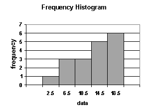
An interval, also called a class, is a set of values within which an observation falls.
- Each interval has a lower limit and an upper limit.
- Intervals must be all-inclusive and non-overlapping.
A frequency distribution is a tabular display of data categorized into a small number of non-overlapping intervals. Note that:
- Each observation can only lie in one interval.
- The total number of intervals will incorporate the whole population.
- The range for an interval is unique. This means a value (observation) can only fall into one interval.
It is important to consider the number of intervals to be used. If too few intervals are used, too much data may be summarized and we may lose important characteristics; if too many intervals are used, we may not summarize enough.
A frequency distribution is constructed by dividing the scores into intervals and counting the number of scores in each interval. The actual number of scores and the percentage of scores in each interval are displayed. This helps in the analysis of large amount of statistical data, and works with all types of measurement scales.
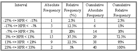
- Absolute frequency is the actual number of observations in a given interval.
- Relative frequency is the result of dividing the absolute frequency of each return interval by the total number of observations.
- Cumulative absolute frequency and cumulative relative frequency are the results from cumulating the absolute and relative frequencies as we move from the first to the last interval.
The following steps are required when organizing data into a frequency distribution together with suggestions on constructing the frequency distribution.
- Identify the highest and lowest values of the observations.
- Setup classes (groups into which data is divided). The classes must be mutually exclusive and of equal size.
- Add up the number of observations and assign each observation to its class.
- Count the number of observations in each class. This is called the class frequency.
Data can be divided into two types: discrete and continuous.
- Discrete: The values in the data set can be counted. There are distinct spaces between the values, such as the number of children in a family or the number of shares comprising an index.
- Continuous: The values in the data set can be measured. There are normally lots of decimal places involved and (theoretically, at least) there are no gaps between permissible values (i.e., all values can be included in the data set). Examples would include the height of a person and the time to complete an assignment. These values can be measured using sufficiently accurate tools to numerous decimal places.
There are two methods that graphically represent continuous data: histograms and frequency polygons.
1. A histogram is a bar chart that displays a frequency distribution. It is constructed as follows:
- The class frequencies are shown on the vertical (y) axis (by the heights of bars drawn next to each other).
- The classes (intervals) are shown on the horizontal (x) axis.
- There is no space between the bars.
From a histogram, we can see quickly where most of the observations lie. The shapes of histograms will vary, depending on the choice of the size of the intervals.
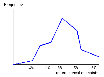
2. The frequency polygon is another means of graphically displaying data. It is similar to a histogram but the bars are replaced by a line joined together. It is constructed in the following manner:
- Absolute frequency for each interval is plotted on the vertical (y) axis.
- The midpoint of each class (interval) is shown on the horizontal (x) axis.
- Neighboring points are connected with a straight line.
Unlike a histogram, a frequency polygon adds a degree of continuity to the presentation of the distribution.
It is helpful, when drawing a frequency polygon, first to draw a histogram in pencil, then to plot the points and join the lines, and finally to rub out the histogram. In this way, the histogram can be used as an initial guide to drawing the polygon.
The relative frequency for a class is calculated by dividing the number of observations in a class by the total number of observations and converting this figure to a percentage (multiplying the fraction by 100). Simply, relative frequency is the percentage of total observations falling within each interval. It is another way of analyzing data; it tells us, for each class, what proportion (or percentage) of data falls in that class.
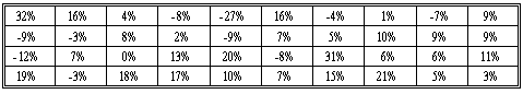
Let's look at an example.
The following table shows the holding period returns of a portfolio of 40 stocks.
The highest HPR is 32% and the lowest one is -27%. Let's use 6 non-overlapping intervals, each with a width of 10%. The first interval starts at -27% and the last one ends at 33%. Therefore, the entire range of the HPRs is covered.
Hint: If, in an examination, your relative frequency column does not sum to 1 (or 100%), you know that you have made a mistake.

Study notes from a previous year's CFA exam:
3. Frequency Distributions